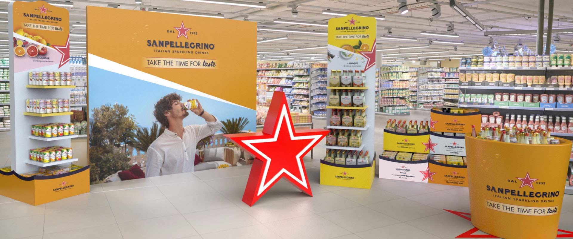
The quality of Sanpellegrino Beverages in points-of-sale across the world.
Italian Sparkling Drinks: below-the-line creativity customised for various retail subchannels
- Customer journey mapping
- Branding
- BTL
- POS activation
- 3D modeling
- Retail materials
- Display units
- Modular corners
Sanpellegrino, a company recognised globally as a symbol of italianness, chose ATC – All Things Communicate to design the international guidelines for activation of the In Home outlet of Sanpellegrino Beverages - also known internationally as Sanpellegrino Italian Sparkling Drinks. An exciting endeavour, involving respecting the heritage of a renowned brand, representing it with the graphic and chromatic languages of the ‘sparkling’ world: without distorting the image of 100% Italian creativity which the brand bears for its international audience, on the one hand; and on the other, making itself noticed in retail outlets with a look that is vibrant, elegant and distinctive.

Below-the-line materials integrate the different values of the brand and its products, balancing their communication strengths according to their role in the path to purchase. The red star, an iconic asset essential to Sanpellegrino’s history and fame, remains in a position of high visibility and recognition, benefitting from the brand’s reputation at the same time reinforcing awareness even outside the world of waters. This element has been integrated with colour patterns that not only suggest connotations of pleasure, vitality and liberty associated with the sparkling world, but also help identify and distinguish the product range. The graphic treatment also uses a selection of emotional images which, depending on the touchpoint, focus on the authenticity and source of the ingredients or on ‘lifestyle’ and consumption moments suggestions in line with the above-the-line communication, to take an unparalleled taste experience also into the point of sale.
If as far as the image is concerned the focus has, naturally, been on internal consistency, the final selection of the actual individual materials has followed a careful strategy of differentiation for each subchannel which has enabled the defining of specific paths to purchase. Within these, dedicated communication materials have been designed, both in function and finishing, to respond to the different characteristics and needs – in terms of space, premiumness, target and products on offer – of the respective channels: from convenience stores to premium retailers to superstores.


