Nexity Italia: web and digital design
A new visual identity for the digital ecosystem of a major real estate player
- Brand Assessment
- UX Strategy
- Concept & Content Creation
- Web Design & Digital Activation
- Photo editing
- Video Editing
- Websites
- Digital strategy
- Photo shoot
- Shooting video and editing
- Back end and CRM integration
- Social Media Management
Nexity, a leading French company in the real estate sector, has chosen ATC - All Things Communicate to build its digital ecosystem and give it an identity capable of interpreting its brand values.
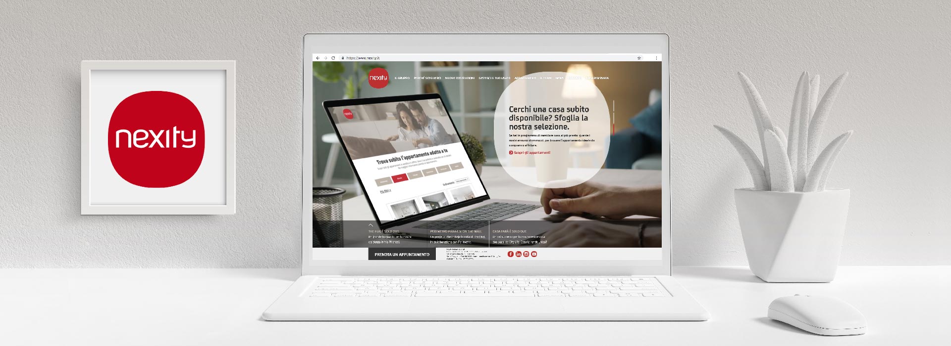
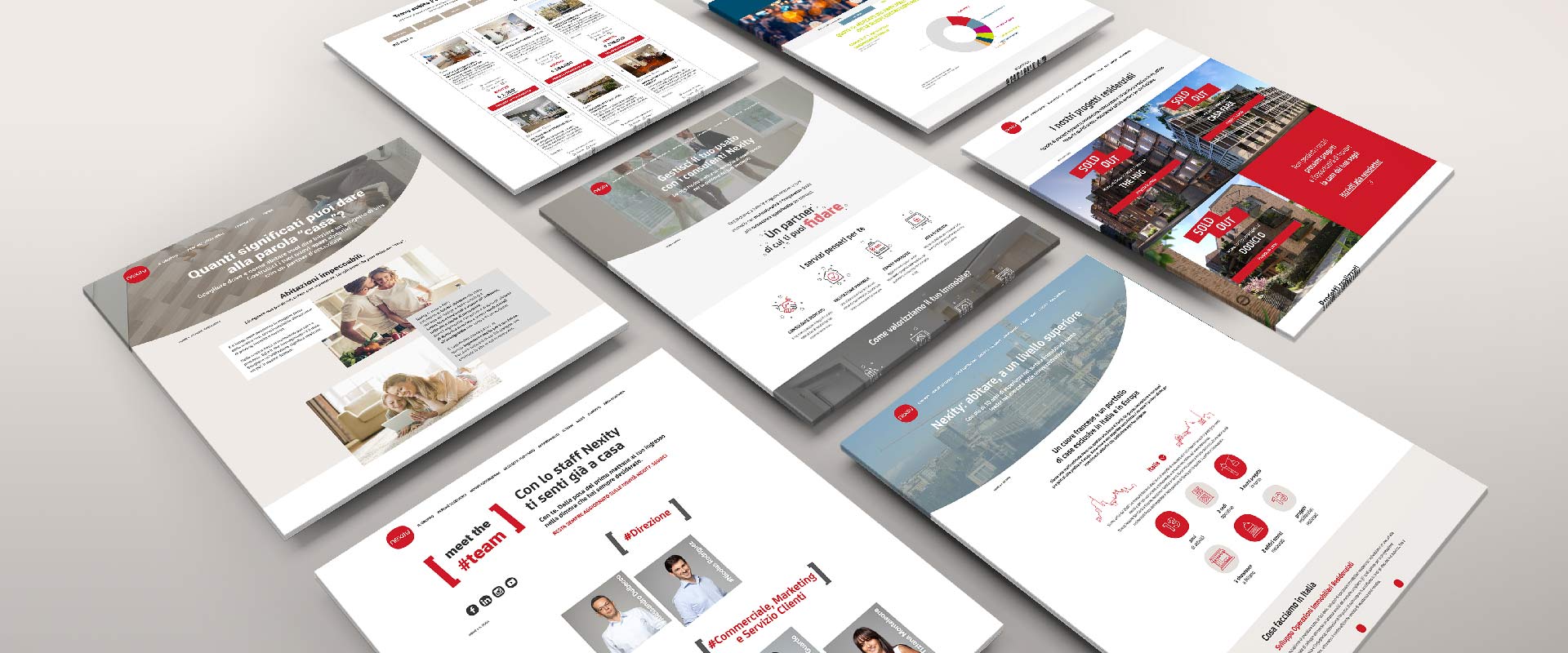
The project started with the creation of a corporate website able to respond to this objective and to communicate Nexity's value proposition in an immediate way. The site also serves as a showcase for the residential projects in progress, for which we developed and integrated the mini-sites, each with its own distinctive identity but in line with the corporate site.
The new corporate website was conceived as a central asset of Nexity's digital identity and acts as a brand hub.
The experience of the user who lands on the homepage is imagined as that of the recent buyer opening the door of their new home with satisfaction: a compact layout that ends in the narrow frame of the viewport. However, through the use of large full screen video-headers the layout is able to generate impact, involvement and curiosity.
And just like being in your own home, moving around Nexity.it is easy, thanks to intuitive navigation and linear information architecture. In fact, the sections of the site allow the user to find the main information, reflecting the quality of the offer and providing support for marketing purposes as well.
The user can also interact through forms that can be filled in to obtain information or book appointments – or, if already registered, by accessing their own reserved area, which contains personal information and documents and is integrated with the backend.
The user experience is conceived of as that of the buyer, opening the door of their new home

The link with the corporate website was also taken into account in the development of the mini-sites dedicated to Nexity residential projects under construction, although each expresses its individual identity with specific graphic elements and original colour palettes, consistency with Nexity.it is assured thanks to the repetition of shared stylistic details.
The landing page of Casa Farà, no longer online once the project was completed, played on the concrete and metaphorical division between exteriors and interiors, with a path of discovery of the offer going from the neighbourhood to the apartment, gradually revealing, in the three pages of the site, all the details of the housing offer.
The mini-site of The Hug communicates the concept of comfort both in the contents and in the visuals of the pages, through the leitmotif of soft lines and sinuous shapes. The "apartments" section allows for a high degree of interactivity on the part of the user, who can navigate through the rooms of the desired apartment type in the sequence they prefer.
The mini-site developed for LAC is based on graphic concepts symbolizing the combination of the elements that characterize this project and its unique position, which are explored section by section. Interactivity is assured thanks to floorplans to explore, photo carousels to swipe on and the garden map.
The mini-site created specifically for the latest project launched, Mirari, shows the same structure as well. Here, the identity of the project is made clear by an aesthetic based on straight lines and a modern design and the user navigation is even more immersive and intuitive than before.
In all minisites the texts are divided into autonomous content sections, each of which can be optimized for search engines on the basis of specific keywords. In this way, each of the pages serves the purpose of better search engine ranking, while ensuring rich content in a visually engaging interface.
We designed the backend of the corporate website taking into account the central role that this platform plays for Nexity stakeholders and operators, who need to use the management system on a daily basis.
Through a linear visualization and intuitive actions, the dashboard integrates access to all the necessary operations, through 3 main sections: "Manage Customer Journey", where the information of CRM users and the actions that involve them are available; "Manage info and documents", where Nexity professionals can also upload the documents that the customer will find on the frontend, and "Nexity Area", where corporate information is located.
The backend also allows the integration of external systems, such as ecommerce, to buy apartments online, or Docusign, to facilitate the sending and digital signing of documents related to sales.
For a more cohesive interaction between the various digital channels on which it is present, Nexity has also entrusted us with the management of the Italian division's LinkedIn, Facebook and Instagram profiles.
The editorial plan is structured following an organization of contents in thematic sections, responding both to business objectives and to those of engaging followers.
The posts present the brand's projects and the advantages linked to the purchase of a Nexity residence, but also integrate topics of cultural interest and lifestyle. These kinds of posts help enrich the profile with content of interest to followers and their daily lives, as well as creating engagement and curiosity around the brand
The organization of the editorial plan and the order of the headings is also characterized by the flexibility needed to adapt to real time communication related to real estate sector events and news, or updates about the brand, the company staff and stakeholders.
We also planned and developed adv campaigns aimed at informing social media users about the launch of new products and services.
In the last few years, we have developed a campaign to introduce the new Nexity resale service and several campaigns about the ongoing residential projects. Each adv campaign has been split in more phases depending on the evolution of brand objectives and on active commercial promotions and has engaged with users through images and videos.


