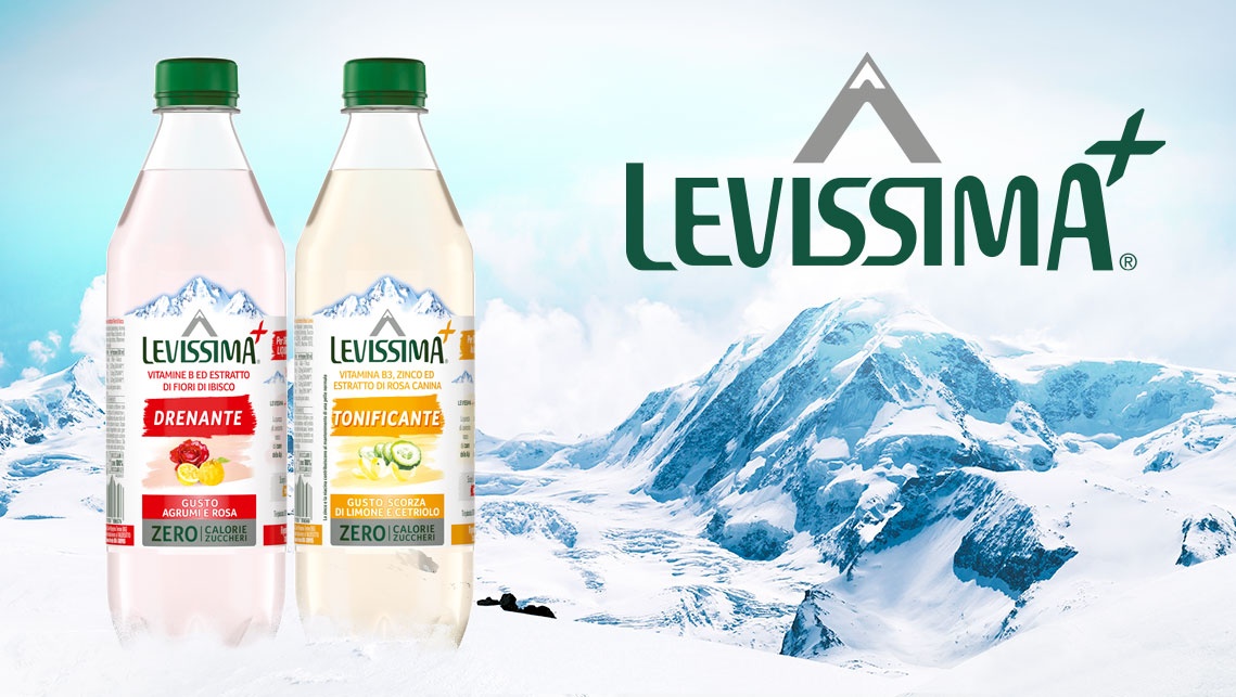
The agency has planned this relaunch starting from a strategic basis: the communicative effect of every element on the 50 cl bottle labels had to be maximised in order to highlight the combination of the purity of the Levissima water and the benefits of vitamins and minerals, a precious resource for the modern lifestyle.
A further step was creating a smooth storytelling, obtained graphically thanks to the selection of specific colours. In this way, the front of pack can grab the attention and encourage shoppers to find out detailed information on the back of the pack.
Two horizontal graphic brushstrokes were introduced on the label. The bright-coloured one encloses the name of the functional benefit while the lighter one works as an abstract surface for the illustration of the ingredients to lean on. The ingredients are the distinctive characteristic of all 6 versions: Vitality (with potassium), Energy (with B-vitamins), Immune System (with zinc), Concentration (with magnesium) and the two innovations - Draining (with vitamin B and hibiscus flowers) and Toning (with vitamin B3, zinc and rose hip extract).
On the back of the label, the main benefit of every specific bottle is highlighted by the same graphic element introduced on the front. Moreover, at the centre of the label, a precise conceptual division in 3 bullet points traces an overview of the benefits: the source, the properties of the ingredients and the distinctive qualities of the taste. Below, a call-to-action promoting cross-selling completes the communication.


